
ARMANDO CULTIVOS
Armando Cultivos makes the best soil for organic crops.
Year
2025
Services
Brand Identity, Creative Direction & Packaging Design
Overview:
Organic Soil Company

The brief:
Armando Cultivos is a brand focused on the development of living substrates and organic soil solutions for growers and producers. The goal of the project was to build a strong and professional visual identity that communicates expertise, approachability, and technical knowledge, while preserving the recognition of the “Armando” character and evolving it into a more functional, scalable, and contemporary system. The identity needed to balance organic and technical elements and remain flexible across multiple formats, products, and future brand extensions.
The outcome:
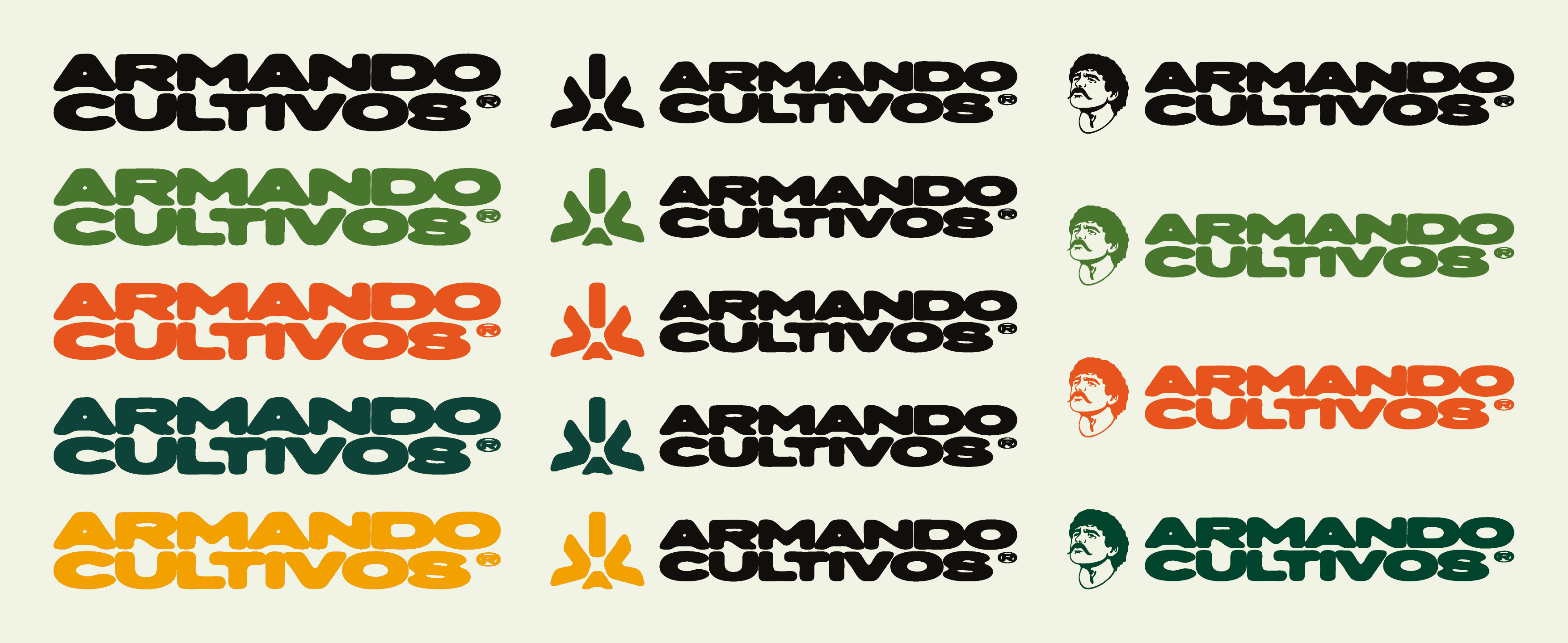
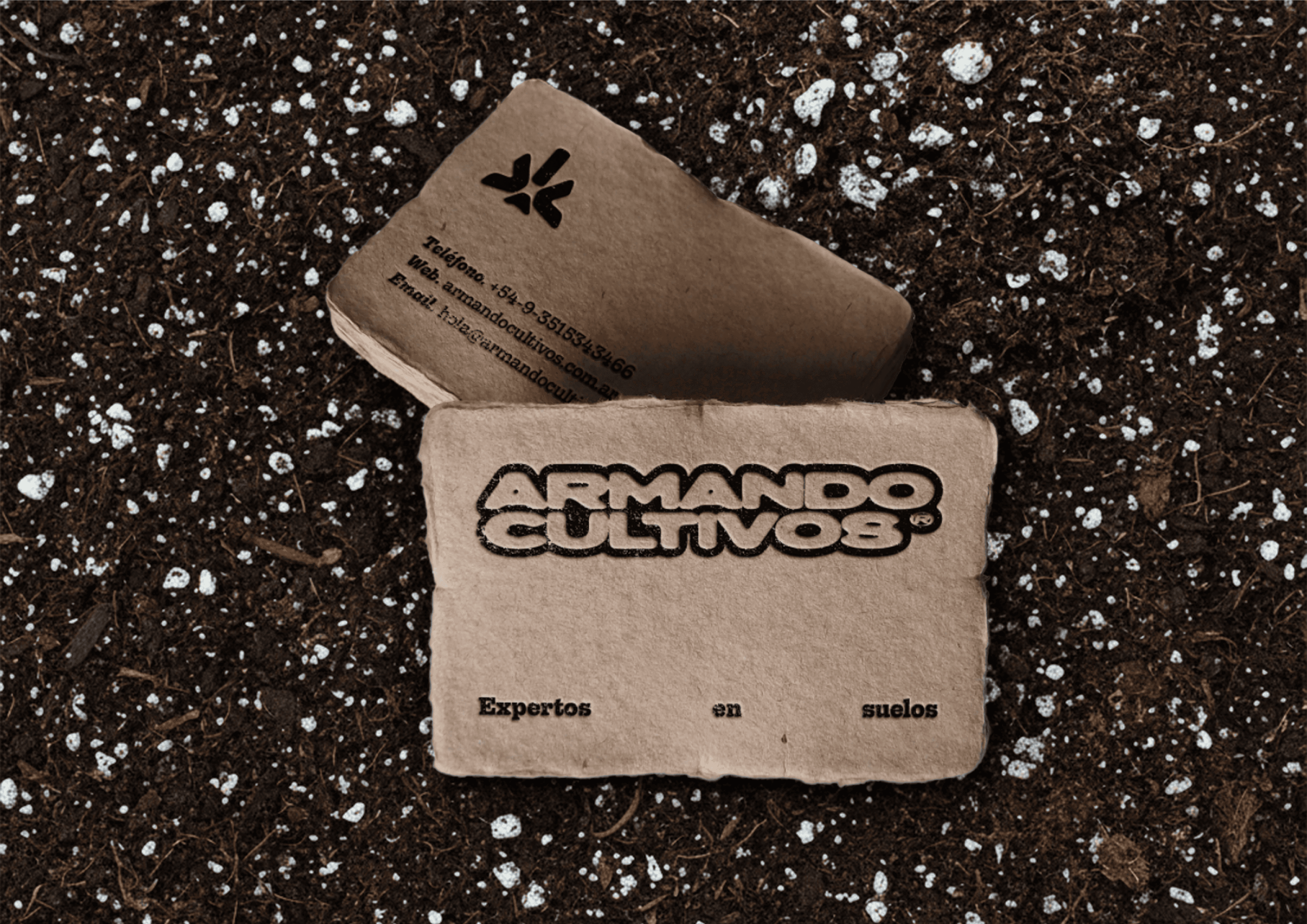
The project began with the strong brand recognition of the “Armando” character, whose essence was preserved through a simplified facial design, resulting in a clearer and more adaptable isotipo. The logotype was developed using a handcrafted type approach, avoiding rigid geometry and straight lines to express warmth, experience, and a direct connection to nature. Its robust structure conveys reliability and expertise, while organic joins and irregular strokes reference movement and soil microorganisms.
A secondary isotipo, derived from the logotype’s forms, was created to introduce a more modern counterpoint to the traditional character. All elements were structured within a grid system, ensuring visual consistency and correct application across all media.
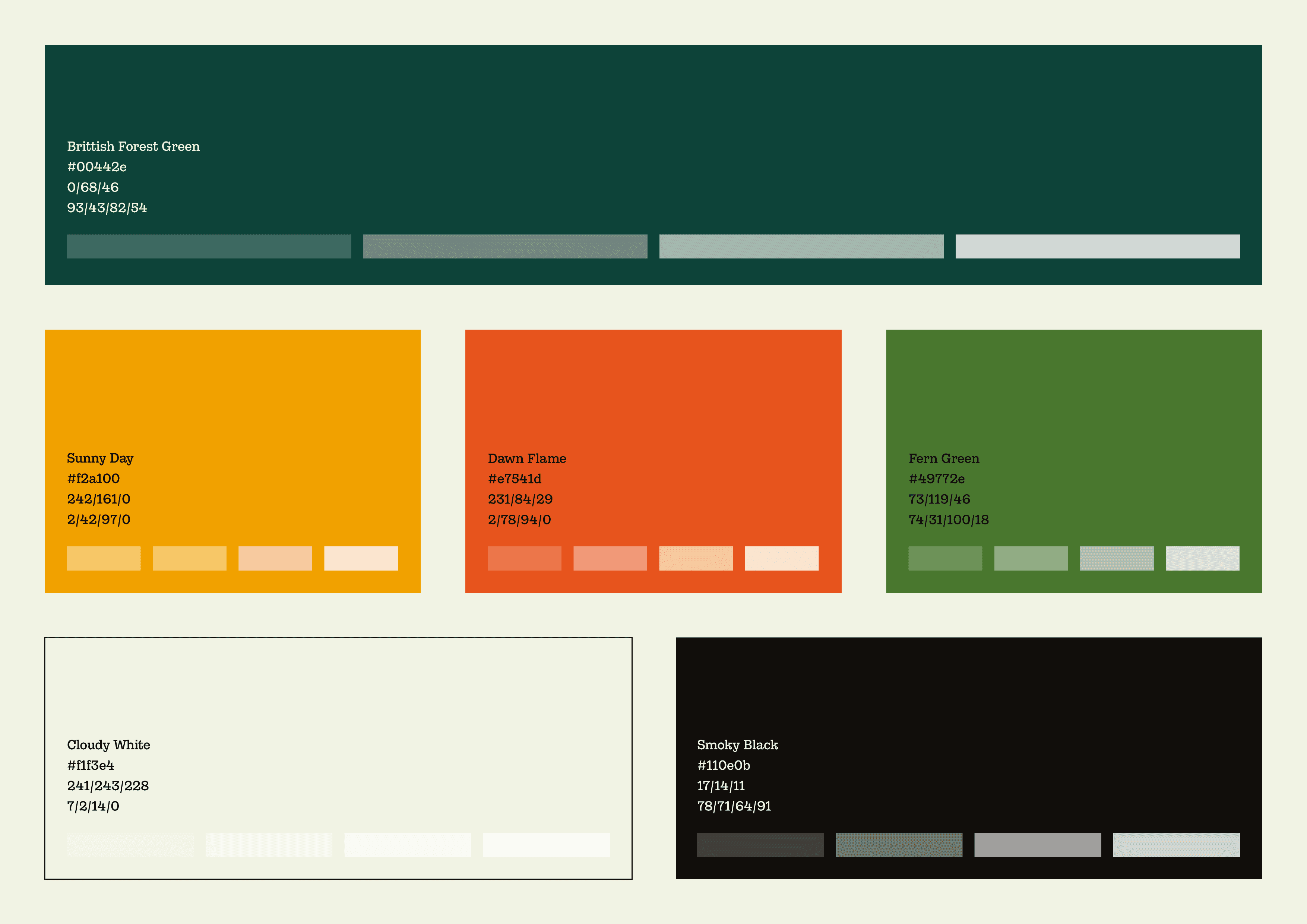
The typographic system is built around Gonzaga as the primary typeface, chosen for its clarity and precision, with FF Blur Pro Volume as a secondary font to reinforce the brand’s organic and expressive character. The color palette draws inspiration from nature, using vibrant, high-contrast tones with transparency variations to expand flexibility across packaging, graphic assets, and digital communication.
The final result is a confident, approachable, and professional identity that communicates technical expertise without losing its human touch, positioning Armando Cultivos as soil experts and supporting the brand’s future expansion.


ARMANDO CULTIVOS
Armando Cultivos makes the best soil for organic crops.
Year
2025
Services
Brand Identity, Creative Direction & Packaging Design
Overview:
Organic Soil Company
The brief:
Armando Cultivos is a brand focused on the development of living substrates and organic soil solutions for growers and producers. The goal of the project was to build a strong and professional visual identity that communicates expertise, approachability, and technical knowledge, while preserving the recognition of the “Armando” character and evolving it into a more functional, scalable, and contemporary system. The identity needed to balance organic and technical elements and remain flexible across multiple formats, products, and future brand extensions.
The outcome:
The project began with the strong brand recognition of the “Armando” character, whose essence was preserved through a simplified facial design, resulting in a clearer and more adaptable isotipo. The logotype was developed using a handcrafted type approach, avoiding rigid geometry and straight lines to express warmth, experience, and a direct connection to nature. Its robust structure conveys reliability and expertise, while organic joins and irregular strokes reference movement and soil microorganisms.
A secondary isotipo, derived from the logotype’s forms, was created to introduce a more modern counterpoint to the traditional character. All elements were structured within a grid system, ensuring visual consistency and correct application across all media.
The typographic system is built around Gonzaga as the primary typeface, chosen for its clarity and precision, with FF Blur Pro Volume as a secondary font to reinforce the brand’s organic and expressive character. The color palette draws inspiration from nature, using vibrant, high-contrast tones with transparency variations to expand flexibility across packaging, graphic assets, and digital communication.
The final result is a confident, approachable, and professional identity that communicates technical expertise without losing its human touch, positioning Armando Cultivos as soil experts and supporting the brand’s future expansion.