
ECLECTICA
An event for emerging talents and artists.
Year
2019
Services
Logo, Graphic Art and sometimes Photography
Overview:
Ecléctica

The brief:
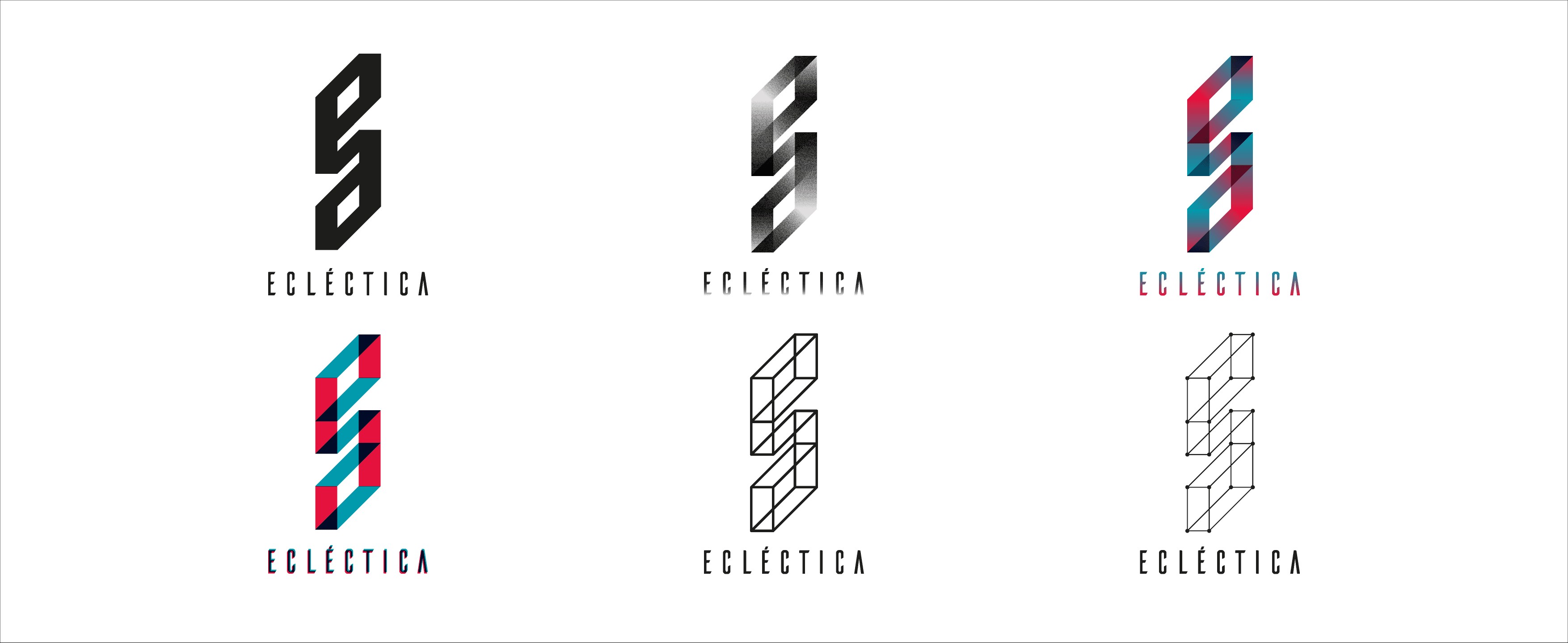
Ecléctica was an independent electronic music event created by a collective of DJs, sound engineers, and music enthusiasts focused on giving visibility to underground artists in Argentina. The project marked my first commissioned work as a designer, developed in close collaboration with the organizers during the final year of my studies. The brief was intentionally open. The team needed a logo and a typographic base without defining colors or a fixed visual system. The identity had to remain open and adaptable, allowing each event’s flyers to respond freely to the artists, the venue, and the music of the night, rather than being constrained by a single visual language. The challenge was to create a recognizable identity that could exist without visual consistency in its applications rooted in music and art as its driving force.
The outcome:
The solution focused on restraint and concept rather than visual excess. A simple logotype was developed, built as an ambigram combining a lowercase e and a (the beginning and end of the word Ecléctica). This dual reading reinforced the idea of hybridity, underground culture, and curiosity, inviting interpretation rather than explanation.
By avoiding a fixed color system and rigid graphic rules, the identity functioned as a constant anchor while each event’s visual communication evolved independently. Flyers were designed as unique pieces tied to the specific lineup, space, and sonic atmosphere of each event, yet the project remained instantly recognizable through its name and symbol.
This approach allowed Ecléctica to build a strong presence without visual repetition, positioning the event as a platform for experimentation, artistic freedom, and emerging talent.

ECLECTICA
An event for emerging talents and artists.
Year
2019
Services
Logo, Graphic Art and sometimes Photography
Overview:
Ecléctica
The brief:
Ecléctica was an independent electronic music event created by a collective of DJs, sound engineers, and music enthusiasts focused on giving visibility to underground artists in Argentina. The project marked my first commissioned work as a designer, developed in close collaboration with the organizers during the final year of my studies. The brief was intentionally open. The team needed a logo and a typographic base without defining colors or a fixed visual system. The identity had to remain open and adaptable, allowing each event’s flyers to respond freely to the artists, the venue, and the music of the night, rather than being constrained by a single visual language. The challenge was to create a recognizable identity that could exist without visual consistency in its applications rooted in music and art as its driving force.
The outcome:
The solution focused on restraint and concept rather than visual excess. A simple logotype was developed, built as an ambigram combining a lowercase e and a (the beginning and end of the word Ecléctica). This dual reading reinforced the idea of hybridity, underground culture, and curiosity, inviting interpretation rather than explanation.
By avoiding a fixed color system and rigid graphic rules, the identity functioned as a constant anchor while each event’s visual communication evolved independently. Flyers were designed as unique pieces tied to the specific lineup, space, and sonic atmosphere of each event, yet the project remained instantly recognizable through its name and symbol.
This approach allowed Ecléctica to build a strong presence without visual repetition, positioning the event as a platform for experimentation, artistic freedom, and emerging talent.