
Gambaru
We delivered a sleek Framer development project.
Year
2025
Services
Branding, Creative Direction, Naming & Packaging
Overview:
Gambaru Café

The brief:
Gambaru is a specialty coffee shop located along Route 40 in Bariloche, Argentina. The goal was to create a name and visual identity inspired by Japanese culture, emphasizing craftsmanship, dedication, and the human touch behind high-quality products. The project aimed to move away from minimalism and embrace the expressive, chaotic nature of Japanese graphic culture, with a one-month timeline aligned with the construction and launch of the food truck.
The outcome:
Through a naming research process focused on Japanese cultural values, the project resulted in Gambaru, a word that represents perseverance, maximum effort, and commitment to giving one’s best, even in the face of difficulty. This concept became the foundation of the brand.
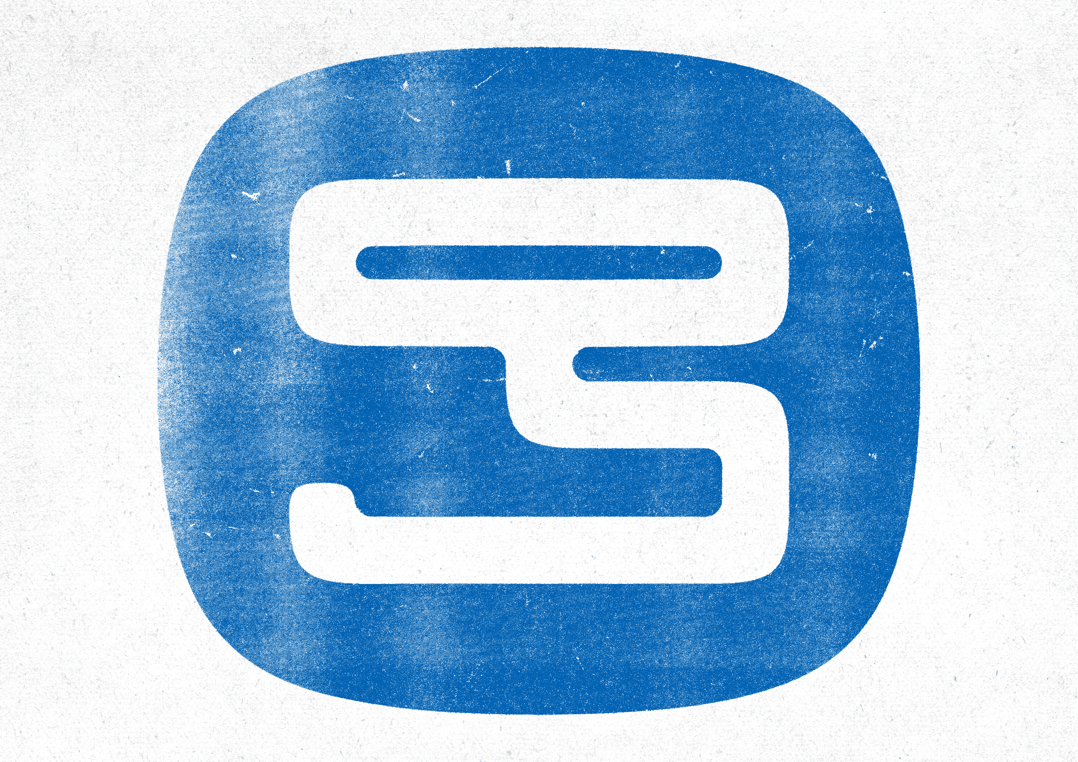
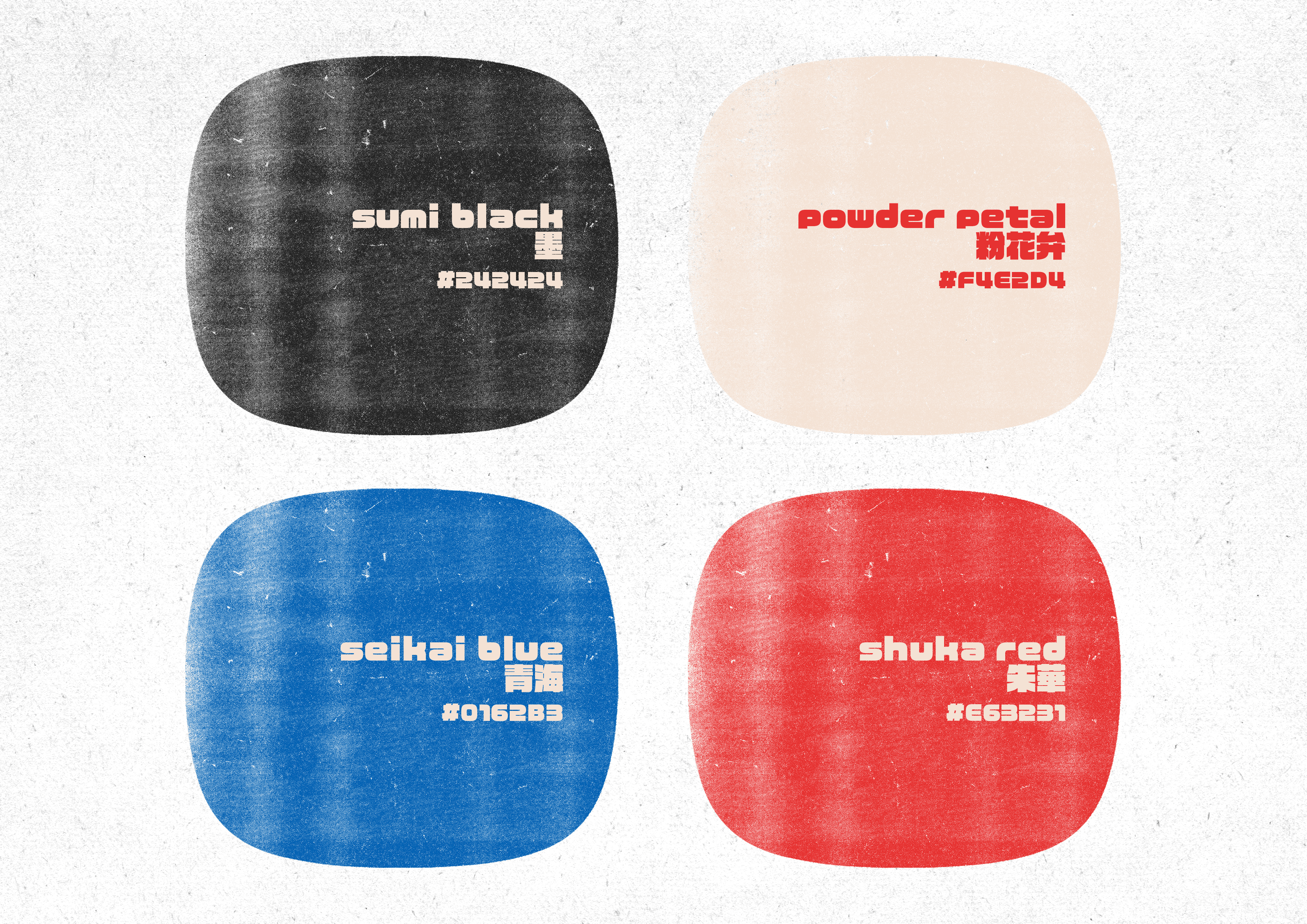
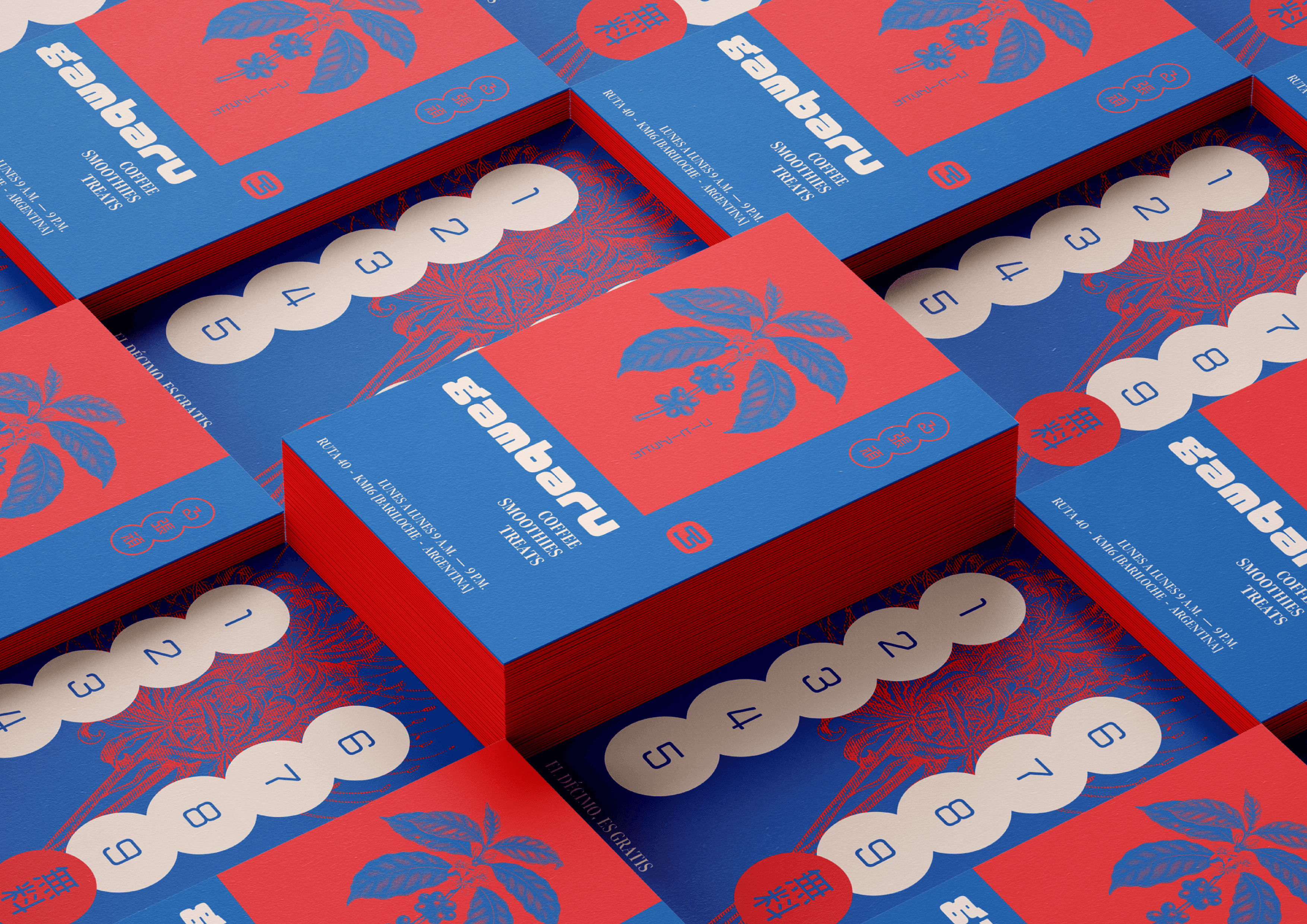
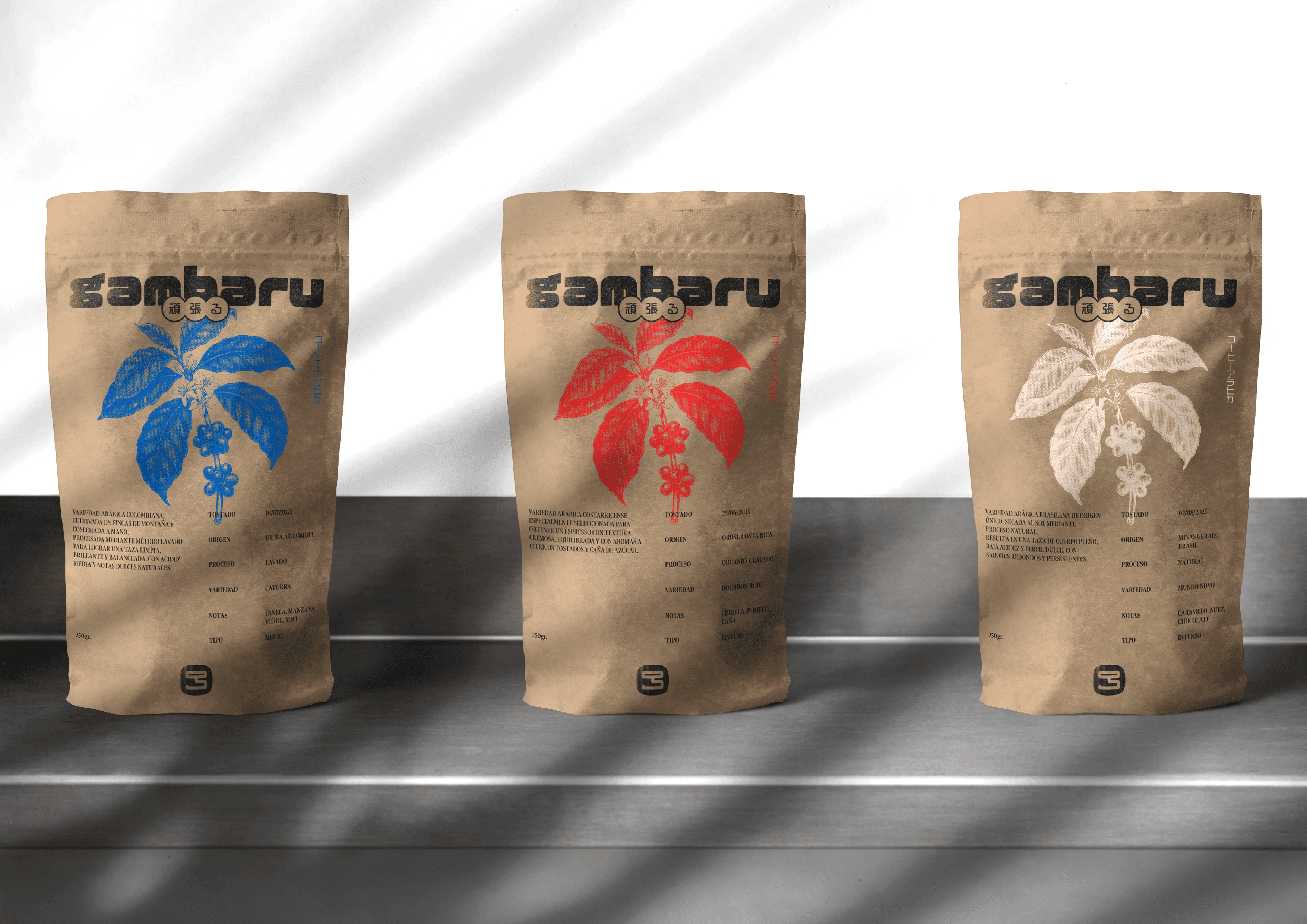
The visual identity was developed with a bold, expressive aesthetic inspired by Japanese urban graphics, deliberately avoiding a minimalist approach. A restrained yet powerful color palette was defined, combining saturated red and blue with sand white and black for contrast and balance. Typeface selection required full support for hiragana and kanji, ensuring authenticity and flexibility across translations. The logo was designed to simultaneously resemble a coffee maker and a kanji character, reinforcing the fusion between coffee culture and Japanese influence.
The project was completed within the established timeline, allowing the brand identity to seamlessly support the food truck setup and the opening of the coffee shop.


Gambaru
We delivered a sleek Framer development project.
Year
2025
Services
Branding, Creative Direction, Naming & Packaging
Overview:
Gambaru Café
The brief:
Gambaru is a specialty coffee shop located along Route 40 in Bariloche, Argentina. The goal was to create a name and visual identity inspired by Japanese culture, emphasizing craftsmanship, dedication, and the human touch behind high-quality products. The project aimed to move away from minimalism and embrace the expressive, chaotic nature of Japanese graphic culture, with a one-month timeline aligned with the construction and launch of the food truck.
The outcome:
Through a naming research process focused on Japanese cultural values, the project resulted in Gambaru, a word that represents perseverance, maximum effort, and commitment to giving one’s best, even in the face of difficulty. This concept became the foundation of the brand.
The visual identity was developed with a bold, expressive aesthetic inspired by Japanese urban graphics, deliberately avoiding a minimalist approach. A restrained yet powerful color palette was defined, combining saturated red and blue with sand white and black for contrast and balance. Typeface selection required full support for hiragana and kanji, ensuring authenticity and flexibility across translations. The logo was designed to simultaneously resemble a coffee maker and a kanji character, reinforcing the fusion between coffee culture and Japanese influence.
The project was completed within the established timeline, allowing the brand identity to seamlessly support the food truck setup and the opening of the coffee shop.